|
|
Post by justin on Jun 19, 2008 19:01:15 GMT
Issue 7 of the "British Fantasy Society award nominated" magazine The Paperback Fanatic is now available to order. Go to www.thepaperbackfanatic.comKev and Rog should have copies by the weekend, so keep an eye out for whatever reviews they may wish to post. Anyone going to the BFS Forum in London on the 19th July? See below. "The BFS is providing a forum for those recommended at Ye Olde Cock Tavern, Fleet Street, London, EC4Y 1AA on Saturday 19th July, doors from 2pm the event starts at 3pm promptly. the purpose of the day is to celebrate those recommended for this years award and to give people a chance to meet those recommended and have a look at the works in question. The judges are the membership of the BFS who have until the 1st August to vote on their top 3 from each category. The winners are then announced at FantasyCon in September" Looking for a few friendly faces/moral support. Is the British Fantasy Society award nominated anthologist Charles Black going to be in attendance? |
|
|
|
Post by David A. Riley on Jun 19, 2008 19:54:39 GMT
After having been so impressed by the last issue, I put my order in for issue 7 straight away. I can't believe how good issue 6 was.
David
|
|
|
|
Post by dem bones on Jun 19, 2008 21:09:07 GMT
Brilliant news, Justin! For those who missed the earlier thread, here's the details: Paperback Fanatic #7 Richard Sala Richard Sala
Laurence James- huge overview of the legendary editor and author of The Angels from Hell biker quartet, the Confessions books, the Witches as James Darke, Deathlands and so much more.
Jeff Jones- checklist and critical assessment of the highly collected fantasy cover artist.
Fred Nolan- a behind the scenes look at the British publishing industry with the larger than life Fred Nolan. Anyone going to the BFS Forum in London on the 19th July? See below. Well, we'll have to see but I'd certainly love to pop along for that. And I guess it would be a good idea if I re-post those details in the Plan 9, Channel 7 section. So .... |
|
|
|
Post by Craig Herbertson on Jun 20, 2008 6:16:34 GMT
stuck in europe I'm afraid. I'd love to attend though.
|
|
|
|
Post by redbrain on Jun 20, 2008 10:04:34 GMT
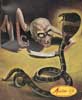
What a cover! How can the blonde sleep at a time like that? Be a pity to wake her, though.  |
|
|
|
Post by dem bones on Jun 21, 2008 11:01:41 GMT
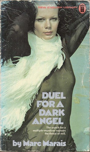
'What a cover!' is right, except I jumped the gun and this is what Paperback Fanatic #7 really looks like! I So I made up my mind that I wasn't gonna post anything until I'd read it through at least once, but it's impossible, barely made it through Fanatical Thoughts before hitting the on button. Mr. M, I know you're ever plotting and scheming to make "improvements" to PF but, trust me, dropping Fanatical Thoughts would not be one and I may have to sic some killer sunshine crabs on you for your own good should you even consider taking such a course. The editorial-cum-letters section is like the last piece of the jigsaw to me - it gives that real club feel to the proceedings. Enough gushing for now: back when I've made progress with Carry On Bleeding (" ... the decade of NEL horrors ...."), the Laurence James retrospective and bibliography, the art of Jeff Jones (whose cover for Margaret Carter's Curse Of The Undead I slated something rotten!), and this Jeff Jones character who rings no bells whatsoever just now but doubtless will .... |
|
|
|
Post by Calenture on Jun 21, 2008 12:05:37 GMT
'What a cover!' is right, except I jumped the gun and this is what Paperback Fanatic #7 really looks like! Mixed feelings, meself. I suppose those paperback covers will appeal to a wider range of punters, and that's probably what counts. No disagreement here anyway. There has to be interaction or a magazine becomes fossilised. You will have your little joke... |
|
|
|
Post by killercrab on Jun 21, 2008 16:13:24 GMT
The cover lacks any written information on the contents. Jeff Jones has his fans ( not just paperback readers) and there is nothing to indicate there's an article on this great fantasy painter inside - which might of shifted a few in itself. I'd of featured a JJ image prominently on the cover!
I think the concept of featuring paperbacks on the cover is essentially sound in regard to core audience identification. I think this layout is better than any of the previous ones utilising book jackets - but there is a chance that issue 7 will look like issue 8 etc , if this is the new template?!
The content subjects however are beyond criticism - the most on-topic issue for me as a fan! I'd miss the editorial myself - even a shortened version would be acceptable. I could also see some space for classified bookseller ads too which might help offset the costs?
Hope this helps?
Ade
|
|
|
|
Post by dem bones on Jun 21, 2008 18:57:59 GMT
You will have your little joke... I wasn't jokiing. I'm not at all familiar with Sudden, Angel - any of the Westerns, and I've never seen a pre-punk fanzine. That's one of the reasons why I love PF. There's not been a single issue where I didn't come away from it slightly more clued up than I went in. Justin hasn't said anything about ditching Fanatical Thoughts. I was merely expressing my enthusiasm for that section. It would be unfair to go too much into it as I'm sure several of you are looking forward to receiving your copies and won't thank me for posting one long spoiler. The NEL and Laurence James content slots in seamlessly with the Peter Haining tribute/ interview/ career overview in #6 and the GNS/ Hells Angels material way back in Pulp Mania: it's all building into a fascinating history of New English Library. Several of the NEL '70 horrors come in for review and we should get some mileage out of whether or not we agree with Justin's assessments of dear old Etienne Aubin, Martin Jenson, Ian Dear, the Dracula Returns series, et al. Me, I was delighted that someone shares my enthusiasm for The Neighbours, one of my top three reads of 2007! And I love - and totally endorse - that well deserved joint dedication!  |
|
|
|
Post by justin on Jun 21, 2008 20:44:34 GMT
Thought I should explain the difference in covers...
Richard Sala is a subscriber to the mag and offered to contribute a cover. I asked for an A5 image which he provided (the occult scene) but when I had to switch the mag back to A4 (the right decision but arrived at by a long and windy route), the image lost that special something. I had to give Richard a choice in whether I ran it or not, and understandably he requested that I didn't. However, I will be using it for publicity material etc.
The new cover is designed as a 'fish cover', in response to it being pointed out that that Anglers Times etc always have a photo of a fish on the cover. But The Paperback Fanatic didn't always have a picture of a paperback on the cover.
Good point from Ade in terms of lack of headlines indicating the content- something I'll address in the next issue. I'm learning all the time...
|
|
|
|
Post by jkdunham on Jun 22, 2008 2:14:12 GMT
The new cover is designed as a 'fish cover'... Good point but I think Ade makes a fair point too about the risk of covers starting to look too similar. The covers are obviously a big part of what people love about old paperbacks but, as far as the cover of the magazine goes, I think original art in a similar vein which presents familiar/much-loved images (bikers, black masses, giant crabs, etc.) will always be appreciated. Or, taking into account restrictions of format or copyright issues, would it be practical to reproduce individual examples of classic cover art (i.e. a Clifton-Dey or a Bruce Pennington) rather than a series of cover scans? I'd be interested to know why you decided to stick with A4. What were all your considerations? I like the current format but I have wondered if PF might not work better A5 in some ways. Also, does the latest issue have a contents page? That's something I've thought might have been handy in past issues. Lastly, I agree that an editorial/letters/comments section is really important, especially in a something like PF which is all about shared passion. |
|
|
|
Post by killercrab on Jun 22, 2008 2:39:18 GMT
The covers are obviously a big part of what people love about old paperbacks but, as far as the cover of the magazine goes, I think original art in a similar vein which presents familiar/much-loved images (bikers, black masses, giant crabs, etc.) will always be appreciated. >>
Strikes me that applying a *fishing weekly* approach doesn't really service pulp fiction to it's potential. There is a vast difference between selling a magazine to fishermen which demands factual covers and enticing paperback fans with covers they've probably seen *before*. By definition pulp writing falls broadly under the Arts , unlike carp monthly or polecat weekly ( lets class them as scientific pastimes for want of a better term).
Paperback Fanatic can be viewed as both a historical resource and one that also enthuses - which requires both new visual and written input in my view.
Agreed on the contents page suggestion.
|
|
|
|
Post by Calenture on Jun 22, 2008 11:19:06 GMT
Personally I'm happy that the A5 format was dropped. The smaller text was murder to read, and I'm aghast to see that on the second paragraph on page 2 I've missed the repeated 'format format' after checking that page twice. Fortunately that trivia will (hopefully) disappear amid the mass of stuff in the magazine that was got right - and I'll swear it's gained new content during that change from A4 to A5. In addition to the Zach Hughes title added as an update to "When Animals Attack" on page 3, here's the 'new NEL' that I thought I'd discovered: ...although it turns out that despite no-one picking me up on it here, it's not as 'new' as I thought, as Hal C F Astell has reviewed it at The Last Page Bookshop. Ho hum. Shuffles off. |
|
|
|
Post by justin on Jun 23, 2008 19:30:02 GMT
Cal, The Dark Angel NEL book was something of a revelation to me, so I still regard you as a pulp Sherlock!
In terms of the format, I wanted to go A5 perfect bound (i.e. with a spine) so people could keep it on their shelf for futue reference. Costs at UK printers were too prohibitive to perfect bind, and I wasn't sure about the quality of reproduction offered by the likes of affordable on-line printers such as lulu.
But seeing as I had designed the whole thing in A5 anyway I decided to still go through with it in normal stapled format. Then the printer explained that the technology he uses for the mag's print run wouldn't be able to collate such a thick magazine. So I had to go back and re-do it in A4. Looks better as a result, but as trusty proof reader Cal mentions, some new material was added and a few errors crept back in due to my stupidity. So A4 is here to stay.
The other changes I alluded to are still in their infancy, but I'm in discussions with someone to publish the magazine, combining my 'expertise' with theirs. It's looking promising....
|
|
|
|
Post by franklinmarsh on Jun 24, 2008 11:59:17 GMT
Can't find the superlatives as usual Justin. The Laurence James article was to die for (the picture of the suited 'n' booted Terry H and the bedenimmed LJ worth the cover price alone). Wonderful behind the scenes stuff. The NEL horror and Fred Nolan articles were great too. Not fussed about Jeff Jones but that's personal taste - I'm looking forward to Richard Clifton-Dey. And presumably you've still got stuff like the Terry Harknett and Christopher Wood interviews plus the Moffatt overview to come?
I've tried nudging Mark Howell but no comeback so far. I'll forward his original reply when I can.
|
|